Home

Showing posts with label Procion MX. Show all posts

Tuesday, November 22, 2016

Carol Soderlund Workshop - 'TRUE COLORS: Developing a Personal Palette'

Carol's samples of dyed fabric using different sets of primary colours.

In the fall I attended a Carol Soderlund workshop at the Pacific Northwest Art School.
'TRUE COLORS: Developing a Personal Palette'

Building a reference for my chosen personal palette.

Early in the week, I met one-on-one with Carol for my Palette Chat where I showed her my chosen palette. While looking at Carol's sample binders with over 80 different colour families she helped me pick a selection of primary colours to work with over the rest of the week.


The 1st class exercise was a group one where we each dyed a set of samples using different primaries. These were cut up  and shared so everyone had small samples for their own binder.

The Big Squeeze Dye Technique

This was one of my favourite techniques Carol showed us. 
It is a very quick way to get a range of values while shifting the hue.

Lovely results from another student using another simple dyeing technique.

This other technique also produced a shift in value and hue while using only 3 primary colour dyes.

Here are my samples. I also incorporated folding the fabric to produce a pattern.

Using this technique one could produce a lot of more randomly dyed, multi-coloured fabric easily and with minimal washout.

My Dye Table

Not only did I learn so much more about colour over the week I also came away with an understanding of many more dyeing techniques. I now know how to dye fabric in a specific colour palette for any future bodies of work.
Thank you Carol for another exceptional workshop
Carol will be back at Pacific Northwest Art School next year, September 9 - 13, 2017 to teach 'In the Thick of It,' a workshop about ways to use thickened Procion MX dyes on fabric.

Thursday, September 15, 2016

Sprinkle Dyeing and Sun Printing Results


Here are my results from a day out in the sun sprinkle dyeing and sun printing.
This fabric had previously been dyed and still needed work.
I sprinkled on a mixed dye. It is interesting to see how the blue migrated further than the red before the damp fabric dried out. The red blob in the bottom is where I sprayed the fabric with water during the drying process.

This dye is made up of many different colours and is sold as black.
Sprinkle dyeing produces a distinctive look that is easily identified when used in a work.

Here are my sprinkle dye results washed and ironed. Admittedly some of the fabrics began as pre-dyed uglies but in most cases sprinkle dyeing has not improved them any. They are still ugly but I may find areas I need that I can cut out. That is the only reason why they will go back into my stash.

My sun printing results were much more promising.
In this sample, I used woven twig place mats and glass stones as resists.

The other samples were produced by twisting painted fabric into knots. The top right sampIe I added a spritz of water to after it was knotted.
So mixed results after a fun day out in the sun with friends.

Monday, September 12, 2016

Sprinkle Dyeing and Sun Printing at VISA, Victoria

During a Mark Makers' summer residency at the Vancouver Island School of Art (VISA) website we decided to take advantage of the beautiful weather and have a dyeing day outside.

We set up tables and brought out buckets of water to the backyard of the school.

I set up my sophisticated system for working with dye powder safely and gave a quick demo on how to fill salt shaker-type containers with dye powder.

While the air was still we explored different sprinkle dye techniques using Procion MX. 
Wet soda-soaked natural fabrics were folded, rolled and scrunched before sprinkling dye powder over them.

Eileen sprinkles dye on flat fabric.

Brenda sprinkles dye on a linen fabric already cut to shape for a garment.

This is a great way to use up old batches of dye powder. It works best with dyes made up from a mix of colours. The different colours separate out and migrate through the damp fabric at different rates.

After lunch, Dale gave us a demo of sun printing using transparent fabric paints on damp cloth. She showed us how many different resists will work to leave an impression.

With the sun overhead, we all got clear impressions of the resists. Brenda is using plastic shapes she has cut out and leaves as a resist on linen fabric she has painted with fabric paint. Others used flowers, grasses, bubble wrap, paper and cotton doilies as resisits. 
The dyed cloth was covered with plastic and taken home to batch before being rinsed and ironed.


Friday, August 12, 2016

Yukon Cryosphere II, Hydrosphere - Work Continues

Working with slippery synthetic sheers I can't keep the large pieces of fabric under control. Solution - hang them on the wall and take down as needed.

My current problem is to find a method for making a soft material appear hard. 
I have made tapered tubes. They need weights in the bottom to keep all lines vertical, the way water falls and freezes.  I considered lead fishing weights but couldn't find any small enough and they would all have to be painted white.

Solution - Beads. I cleaned out my white bead stash then scoured all thrift stores in a 20-mile radius. I sorted them by size and made 3 different soup mixes.

The beads are successfully doing the job of weighing down the points but now the tubes don't look substantial enough. I have decided to stuff each tube with fine interfacing. It took a long time and was hard on my hands.

To give my hands a break I started making the flowing water panels - cheesecloth dry-felted onto flat sheer tubes.

I am laying out the flowing water panels to see if I had enough of them and enough variety in length and width.
In the meantime, in the back of my mind, I am working on how to hang these individual tubes and panels. Percolation time, again.

Friday, April 29, 2016

Carol Soderlund's Dyeing technique

Last year I attended one of Carol Soderlund's workshops and learnt how to dye neutral colours using Procion MX.
She also taught us her dye technique that I have since been able to set up in my studio.
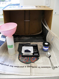
This is the set-up for weighing dye powder to make the stock solution - cardboard box, newspaper, spray bottle full of water (not shown), face mask (not shown), fresh dye powder from Pro Chem, scale from Amazon.


Dye Station
Dye weighing and stock solutions behind, dye mixing and dye application in front. 
This set up is to make colour samples. I would move the dye application to a larger table to dye yardage.

Batching
 Dye samples on plastic covered tables overnight to 24 hours plus.

Rinsing 
Keeping light and dark fabrics separate the excess dye is washed out under cold running water in the right-hand sink. Then the fabric is put into fresh, cold water without being crowded, on the left side.

Filling the stock pot from the instant hot water tap, kept at just below boiling temperature.

Setting the Dye
The pot is put on an induction hot plate. The temperature is set at boiling and timer for 10 minutes.
After the fabric has been boiled it is transferred to the spinner where excess water is spun out and drained out into the sink.

Polishing
I like to steam iron damp fabric dry. In laundry jargon, it is called polishing. 
I use a Reliable brand, heavy iron that produces a lot of steam.

The rectangle shaped ironing board is ideal for ironing yardage but there is a weakness in the design. When working at the left end of the board it tends to tip. My solution is a counter-weight at the other end - a lovely piece of granite that turned up when earthworks were going on for the Backyard project.
This dyeing set up is simple, flexible and works so well. I am very grateful to Carol for so generously sharing what she has learnt over years of experimentation to understand the fine details of the dyeing process.

Monday, November 30, 2015

50 Shades of Grey - A Carol Soderlund Workshop at Pacific Northwest Art Centre, Washington

I was fortunate to be able to attend one of Carol Soderlund's workshops- Carol's website.
She taught us her dyeing techniques while guiding our explorations of the colour wheel's neutral territory. With Carol exploring neutrals is like going down a rabbit hole.

Carol applies the dye in her unique way to get an even distribution of colour on the sample.
We cut up all of our samples and shared them with everyone else in the class.
Carol has developed a system for filing samples with their recipes in a binder making it a valuable resource.

Carol is looking very pleased because this is an exciting day in the life of a die-hard dyer.
A package arrived from Rupert and Spider containing a pot of the very first neutral grey in a pure dye powder. Up until now all greys were a mix of other colours and they tended to separate when dyeing.

Carol gave us an exercise in gradation to test the new grey dye.
She gave each of us a pure colour and using her dyeing technique we made controlled samples from the pure colour through to grey.
The results were most pleasing.

Those who wanted to went outside to learn about different discharge methods and the effects on different colours.

We got some exciting results.

Carol is an excellent teacher and I learned so much from her over the 5 days.
I learnt a new dyeing technique and vastly expanded my understanding of where neutral colours come from. 
Every student came away with a binder full of samples and recipes for hundreds of neutral colours and the understanding of how to make even more.
I look forward to taking another class with Carol.

Saturday, October 24, 2015

VISDA Exhibition 'Garden Tapestry' at Portals, Duncan

Louise Slodoban, 'In An Artist's Garden' 
Photo transfer, procion dyed cloth, mono printing, screen printing, sun prints, machine & hand stitched.
Louise was inspired by a visit to Grant Leier and Nixie Barton's Studio Garden at Yellow Point.

The Vancouver Island Surface Design Association has an exhibition in the Portals gallery in the CVAC Centre of Arts, Culture and Heritage until November 10, 2015.

Georgina Dingwell, 'At Night in the Garden'
Printed surface with silk overlay and stitching.
"This piece is about the way we perceive darkness. The mind can take us to scary places even in the realm of beauty in a garden."

All artists worked within a 12" x 60" or 72" framework so there was uniformity in the size of the works. This serves to unify a wide range of styles, techniques, materials and ideas.

Elserine Sprenger, "karesansui" (dry landscape)
Handwoven, linen, silk, raffia, stones, madder, indigo.
"This piece is woven in a partial double weave structure and symbolises the strength and at the same time the fragility of Mother Nature; the stones that have survived millennia and the linen which so easily deteriorates when exposed to the weather."

 
karesansui (dry landscape), detail

Sarah McLaren, 'Joy'
"Own hand dyed linen/cotton blend fabric, hand appliqued with silk thread, machine quilted, wool batting, binding done by hand. 
Inspired by whimsical floral shapes, open weave linen, a love of colour subtleties and a passion for fabric and stitching, my intention was to design and create a joyful art-quilt garden tapestry."


'Joy,' detail. 
Sorry, the colours are way off in these images of the works. The gallery has the work well lit which makes for difficult photographic conditions.

Sarah beside her work. 
The colours here are closer to reality, but images of textiles never really do them justice. You will have to go to Duncan to see for yourself. 

The exhibition is on until November 10, 2015.
The gallery is open Monday through to Saturday, 10 am to 5 pm.

Thursday, September 17, 2015

Kim Eichler-Messmer Dye Workshop

For a couple of years now I had been wanting to attend Kim Eichler-Messmer 's Percentage Dyeing Workshop so I signed up straight away when I saw she was coming to the Pacific Northwest Art School in Coupeville, Washington. (Check out  their just published 2016 calendar)

Kim practices and teaches a percentage system that makes it possible to reproduce colours exactly. 
Day one focused on mastering the basic system of weighing the fabric then adding precise amounts of dye from stock solutions. 

We each made 2 sets of our basic palettes, one in dark values and one in light values. We used these two sets as a starting point for all of the following exercises.

Homework was to find some favourite images and isolate 4 to 7 of the most important colours in each of them. Next day we sifted through a huge pile of Kim's paint chips and the ones we had brought with us to find colour matches with our chosen images.


Then we set about dyeing white fabric to match the colours in our chosen images. 
That was a fun exercise and a most valuable skill to learn.
We also learnt how to made many different types of colour gradations.


Each person cut up their samples and shared them with everyone else. We left the class with a big bundle of samples and instructions on how to reproduce each one.

I rewrote all of the recipes into a new dye notebook, numbering each one to match with the unique number on each sample. What a valuable resource that I can keep adding to. 
I used to dye lots of fabric in  a haphazard, non-repeatable way then pick from the fabric pile the colour I was looking for. Now I know how to dye to replicate any colour, make a value gradation, from the palest to the darkest, produce a 2-colour gradation going from bright to neutral with no change in value and how to scale up to any quantity of fabric with consistent results. No more random dyeing for me.
Thank you, Kim, for  teaching an invaluable technique with infectious enthusiasm, never-ending patience and a great depth of dye knowledge.