Home

Showing posts with label art. Show all posts

Friday, August 11, 2017

Playing Tourists At Home When Company Comes

You know how it is - you visit the local sites when company comes.
The most popular place to visit with our company is Butchart Gardens which are not far from home.
From early spring there is a spectacular show of blooms until late in the fall.

Japanese Garden
Every visit I see landscaping ideas.

Here is a multi-functional edging that fits my garden design requirements.

Shakkei design in Butchart Gardens - a Japanese garden design concept literally meaning 'the borrowing of scenery.' The garden elements - a round hole in a cedar hedge - take advantage of appealing elements in the distant landscape - the tranquil Todd Inlet with boats.

Within its well-designed gardens, Butchart offers the wide range of scale designers aim for - the micro view of a bloom at one's feet to the macro view of plantings across the expanse of a worked out quarry.

Another popular spot we take our company is Sooke Harbour House after a drive through a forest and along the shoreline. I love to search out the newest art in the garden as well as checking their organic food gardens.
This aged, split cedar screen does the job of screening off a temporary event tent giving some privacy to those on either side.

And of course, there is the art littered everywhere inside Sooke Harbour House.
Having company keeps us continuing to explore where we live when we find the new and re-explore when we thought was familiar.

Monday, April 17, 2017

Working With Itten's 7 Colour Contrasts

"Our sense organs can function only by means of comparisons. The eye accepts a line as long when a shorter line is presented for comparison. The same line is taken as short when the line compared with it is longer. Colour effects are similarly intensified or weakened by contrasts." Itten The Elements of Color, p. 32

Itten's 7 kinds of colour contrast:
1. Contrast of hue
2. Light-dark contrast
3. Cold-warm contrast
4.Complementary contrast
5.Simultaneous contrast
6. Contrast of saturation
7. Contrast of extension

With this Synesthesia series of work, I am working with one hue/colour at a time, defined as a monochromatic colour scheme. It means I am not able to use #1. Contrast of hue. For each individual work to be successful I need to work with other colour properties to achieve contrast.

The Synesthesia series aims to show how I feel about each colour's energy. To express that energy I focus on line, without making a thing, shape or motif and I work with value. #2 Light-dark contrast is my main design tool

# 2. Light-dark contrast. Here I have overlapped with an off-set, dark to light threads over a dark to light ground.

To me, this colour evokes calmness, an immensity in its calmness. To give this feeling I need to show a low level of contrast but still need to have some contrasting elements for the work to be successful, otherwise, there is no energy at work.
I took advantage of one of textiles' strongest features - texture. This low contrast dark to light fabric line up is still interesting to the eye because each fabric has a different texture.
These fabrics also show #6 Contrast of saturation at a low level but the eye can still see a brighter blue beside a dull blue.

When checking for #2 Light-dark contrast I look through a 'Ruby-Beholder' - a red or green plastic strip and or I take a picture with my camera to get a black and white image. 
Here I decided there was just enough contrast of light and dark for the eye/brain to notice while still giving off a calm vibe.

Including too wide a range of light to dark generally is not successful. One needs to limit the range of values to a group or block along the light-dark continuum.
When I am designing a work I take out all of the fabrics I have that would be suitable as far as their other characteristics are concerned. I arrange them in a continuous line from light to dark. I then look along the line to decide which section would best express the feel and energy of that colour. I work with fabrics in that section and put away those either side of the chosen ones.

I am making colour cards to go with each Synesthesia work. The cards have strips of fabric glued to them. When I select the fabrics I aim for the maximum range of values, saturation, and cold-warm contrast because the purpose of the cards is to show the full range of the colour's properties.

A stop for a quick dark-light check during construction. 
Is there enough contrast to effectively express the energy I feel from this colour?

When I make work I do a lot of research and pre-planning in a sketchbook. Next, I sample with the actual fabrics. When I am actually making the work it feels as though I am back at the trial and error stage but this time I am working towards producing that image or feeling I have of what the work should be and it guides my decisions.


Wednesday, December 21, 2016

Visiting Washington DC Museums - Textile Museum, Renwick, National Museum of Women in the Arts


After attending the Textile Society of America Symposium in Savannah Ingrid and I flew up to Washington DC with the intention of checking out the newly relocated Textile Museum now on the George Washington University campus. Unfortunately, our timing was not great. We could only enjoy the shop because the gallery was closed while a new exhibition was being installed.
We visited the Renwick Gallery. I didn't take my camera because I wanted to focus on looking at the work and thinking about it. Sometimes while I am taking pictures/photographs I feel as though I am missing out on the full experience. 
We also visited the outstanding National Museum of Women in the Arts and spent many hours working our way up through the floors of the gleaming marble building.
On the top gallery floor, we thoroughly enjoyed the current contemporary exhibition "No Man's Land - Women Artists from the Rubell Family Collection" where the work was often provocative, cheeky and humorous, as its title suggests.


I particularly enjoyed artists whose use of particular materials was intriguingly icky and so full humour.
Karin Upson's 'Kiss 8' is part of her " The Larry Project." There is bit of a weird story about Larry which led her to paint a portrait of Larry and at the same time a self-portrait. While both portraits were still wet she pressed the 2 together creating 'a pair of unsettling hybrid faces.'

The paint was so thick and textured one had to step back quite a distance before the faces emerged.

Analia Saban's 'Acrylic in Canvas' was so tongue-in-cheek. The paint wasn't on the canvas as is 'normal' with fine art, instead, she filled a canvas bag with paint so it was in the canvas. It was kind of icky while at the same time humourous.

Solange Pessoa's 'Hammock' looked from the entrance to the room like the suspended intestines of a huge beast. But it was not what it seemed. On closer inspection, the materials were familiar: fabric earth and sponges. Up close the mass and scale were somehow comforting which was a huge shift my first impression.

Dianna Molzan's 'Untiled' is work toying with the definition of fine art as paint on a stretched canvas mounted to look as though it is floating against a wall. Dianne took each of those elements and played with them. She removed the vertical threads from the canvas while leaving the horizontal threads mounted conventionally to the stretcher bars. Then she applied paint to the remaining draped threads. I enjoyed the way she had cleverly brought together the fine art expectations with the materiality of craft and women's detailed repetitious work.


Rosemarie Trockel's 'Colony' is another play on the definition of what is fine art. From a distance, her work looks to be worked in the Colour Field style where large blocks of flat colour cover the stretched canvas.

Closer inspection reveals it is not what it seems and so questions the definition of fine art.
Rosemarie is quoted as saying, "I tried to take wool, which was viewed as a woman's material, out of that context and to rework it in a neutral process of production."

Lots of food for thought.


Saturday, June 25, 2016

Surprise Visual Treat While Out Malling

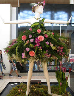
While rushing through the mall to pick up a few things I was slowed down by a visual treat.


Mannequins dressed in blooms.

Dressed by 'Victoria's best floral designers'

The mannequins were still being dressed so some weren't complete.

But I saw them when the flowers were at their freshest.

The event was called 'Victoria. Stop and Smell the Roses'

It certainly had that effect on me and on others passing by.

Friday, June 3, 2016

Professor Kerry Mason Speaks About Emily Carr at the Gathering at the Edge

Professor Kerry Mason and world authority on all things Emily Carr gives a presentation to the Gatherers about the artist's sketches, paintings, textiles and pottery.

I have the job of introducing Kerry

Sheila Wex, BC + Yukon representative for SDA and Barbara McCaffrey, Gathering at the Edge committee member.


Everyone was captivated by the way Kerry talked about the BC artist Emily Carr. 
In a post-event survey, people were asked, 'What did you like about the Event (the 3-day Gathering)?'
"Loved the lecture about Emily Carr,"
"Learning about Emily Carr. Such a wonderful talk!"
"Everything was so well thought out in detail but my very favourite was the Emily Carr 
presentation by Dr. Kerry Mason."


Saturday, April 23, 2016

All Beings Confluence - Martha Cole's Community Project in Victoria

Martha Cole, a Saskatchewan fibre artist, has brought her monumental community art project to Victoria for the first time. You can see it in the Cadboro Bay United Church until May.

"All Beings Confluence is a community-based, interactive project that was directly inspired by Carolyn McDade, a composer, social activist and environmentalist whose music has sustained and nourished many over the decades."

The opening reception at Cadboro Bay United Church was a moving experience. One could walk around and through the many panels while listening to music, singing and poetry readings.

Martha explained how the project came about and how she came to bring it to Victoria.
Next stop is Parksville, Vancouver Island.

When Martha arrives in a community she runs a workshop where people work on long sheer panels each depicting one being found on our planet. These panels are then hung together with previously made panels creating paths and a changing kaleidoscope of views through transparent layers.
Here is the website to learn more.

Friday, April 15, 2016

Studio: Pattern Language # 145 Bulk Storage


Pattern Language #145 Bulk Storage
Problem - 'In houses and workplaces there is always some need for bulk storage space; ...- all those things which you are not ready to throw away, and yet not using everyday.'
Marie Kondo would agree this problem needs a solution but those who work with cloth have a much greater need for lots of bulk storage area.
The architect took advantage of the sloping ground and with only a little more excavation we have a 'crawlspace' under the studio. Our municipality does not allow a full height room in an outbuilding but 6' 2" is still a comfortable height to move around freely in.
Coming in through the side door to the left is my natural dye storage station. That is Japanese indigo hanging to dry and walnut dye in the jars, both studio warming gifts from thoughtful friends. The plastic containers are 2 different types of rust buckets.

To the right of the opening is storage room for leftover building materials for repairs and other uses. I am also drying 7-foot tall teasel stems here.

Further along this side is where I placed all sorts of hanging devices and the longest packing materials.

One day I found this boat stored in an empty spot! I was assured it was the perfect spot for it over the winter. It can stay as long as I don't need that space

Straight ahead is where I store completed artworks in their shipping materials. Most of my finished work I prefer to hang in the house because it fares better there.

Into a small alcove is a stack of packaging and shipping materials...

...and to the left my Etsy packaging and shipping supplies, pillow forms and pillow covers.

 In the centre of the alcove are 2 small raised tables where I package works for shipping.

We finished the crawlspace with a polished concrete floor and low-grade plywood on the walls, both hard wearing, low maintenance, low-cost finishes and utilitarian in style. It is completely moisture-proof and there is a small wall heater on a thermostat to keep the room above freezing in winter. It works out about 50% of the whole building area is flexible bulk storage space.

Pattern Language # 145 Bulk Storage Solution
'Do not leave bulk storage til last or forget it. Include a volume for bulk storage in the building - its floor area at least 15 to 20 percent of the whole building area - not less. Place this storage somewhere in the building where it costs less than other rooms - because, of course, it doesn't need a finish.'

Check.