Home

Monday, February 15, 2010

Knitting and the Olympics

What a great combination. With all of the Olympic coverage on TV, I have been doing a lot of knitting. I just finished a pair of mittens from a kit a friend brought back for me after her summer trip through Nova Scotia a few summers ago.

The simple slip stitch pattern is easy to do while watching the screen so I started another pair using wool from New Zealand this time - a soft 10 ply fine merino with an variegated 8 ply wool. The colours are in short lengths so when used to make large textile pieces as for a sweater the colours look spotty. But the short lengths of colour are ideal for slip stitch patterns.

This winter I have been wearing these fingerless gloves. Yes, the winters are that mild here in Victoria. I bought them in 'Hands of the World', a very interesting store in Pike Place Market in Seattle. The owner, Cynthia Hope, has a great eye for quality hand made items that she sources from all over the world.
When visiting Seattle I got a bit caught out with the cold windy weather and having not brought a warm enough jacket with me. So I bought the mittens and a bright red Indian silk scarf in the store and they kept me warm during our days in Seattle.
Posted by Picasa

Saturday, February 13, 2010

Maltwood Exhibition - Not!

Here are some drawings in my sketchbook from the time Articulation did a study of the forest ecosystems on Vancouver Island.

We were all very excited about getting a booking in the University of Victoria's Maltwood Gallery for our work that resulted from our studies.
The exhibition was booked for April 2010. We were all working feverishly in our studios across the country to produce a body of work we have called 'Standing Relations' when....

...we got dumped!!! 2 months out from the exhibition date. The reason given for the cancellation was the building is to have seismic upgrading work done on it during the time of our booked exhibition.
We have been told to contact the gallery in 6 months. That's it. No suggestions or help finding an alternative space. As you can imagine, we were all shocked because we were all so into producing the work. Once we got over the shock, most of us felt as though we had lost our momentum to keep going to finish the works. I know my large work stopped dead. Remember, I was making regular posts on its progress.
But now our next booked exhibition is fast approaching, the Canadian Quilt Association's biennial conference, to be held in Calgary this year, at the end of April beginning of May. I may just get back into working on my 'Standing Relations' work. Will keep you posted.
Posted by Picasa

Wednesday, February 10, 2010

Findings


The other day I came across a magnificent growth of fungus on a row of tree stumps.
They appear to me to have so much potential to be interpreted in fibre - short row knitting, couching, applique, . . . .
Posted by Picasa

Wednesday, February 3, 2010

The Ups of Spring

When I got back from the UK some work I had produced for my BA(Hons) studies with JC School of Textile Arts, I put it out in the garden. It is a paper version of a men's suit jacket. Much like the paper possessions sold in Chinese funeral stores, I made a paper suit to return it back to nature as an obsolete, inappropriate garment for the contemporary male to wear since I found it was based on armour.
So far with all of the rain and fog there has not been much decay, just a bit of discolouration. The anachronistic male suit may be harder to get rid of than I thought.


The 'up' spring news is I spied our first spring flower yesterday. I feel as though the garden is waiting for just a small rise in temperature and it will burst into life. I have not been in this house in the spring so I am looking forward to it.
As part of spring and part of this module of work, I put threads out in the garden for the birds to take their pick while shopping for nest building supplies.


We get a lot of different birds visiting so i put out a variety of threads to suit every one's tastes.


We have a plant called charity that has been flowering all winter and as a result we have had regular visits from a variety of hummingbirds. We also saw a pileated woodpecker, well heard it hard at work before we saw it. Being a key ecosystem species, I was very pleased to see it because it means its activities allow a whole web of other fauna to visit and live on our property.
Posted by Picasa

Monday, February 1, 2010

My Studio

This is a view of my studio. The 2 left hand tables hold my machines. The middle table is where I work things out and the right hand table you can just see the corner of, is my cutting table. The windows face south and provide lots of light during overcast winter days. It could be a bit bright in the summer months so I have blinds to install.

In the centre of the room are 3 tables that I stand up to work at. Underneath I store stuff in carts on wheels so I can wheel them out to the area where I am working. The far right hand wall holds basic fabrics, papers for design work and lots of collections of things: tools, glues, buttons. The wall behind is my design wall.


This is how I organise backup material for each project I am working on. The bottom half of shelves holds collected material to file in my reference library. I generally file only once I can't fit anything more onto the shelf.
So that's my new studio. I still have a few things to set up, like the blinds, a music system, the wet studio, pin boards but so far it is working very well. I have so much more room than in my previous space so I am finding I am able to work on more than one project at a time.
Posted by Picasa

Sunday, January 31, 2010

Back After a Disaster

Here I am back after a disaster. The hard drive on my lap top died, the day its warranty expired. It has taken HP nearly 3 weeks to send me a new one. But now I am back, up and running. Thank goodness I am a cloud user of the Internet otherwise I would have lost everything. No, I hadn't backed up much even though I was given a separate saving device thingy for my birthday. I was always too busy to stop and save. I have learnt the alternative is way more time consuming.
I have to start again building a library of images. Here are some that were on my camera card.

This is the entrance to the 2 rooms off my main studio. When we moved into the house I took over a bedroom with dark green walls. Our son painted the walls for me. I chose a buttery cream to give maximum light reflection. It maybe a bit too warm to be neutral but it sure makes for a cheery space to work in.
I had left the 2 smaller rooms dark green but have since decided they were too dark to be functional. So they recently got painted the same cream as the main room.

This is the stripped storage room on the left, in the middle of its paint job. I forgot to take the 'before' pictures of the green colour to show the transformation.
.
The room on the right is a bathroom that I am setting up as my wet studio. I still have to seal the stone tiles so I can easily wipe up drips and splashes.

This is one of my work stations where I do writing types of tasks. I am still looking for the right kind of material to put up on the walls to make inspirational pin boards.
Posted by Picasa

Monday, January 11, 2010

New Work for the Maltwood


This past week I have been working on a new work for Articulation's up coming exhibition in the University of Victoria's Maltwood Gallery. The ideas for this work have been developing for quite awhile, ever since Articulation did a study week on Vancouver Island in September 2007. All members are now in their studios focusing on producing their responses to what they saw in the rain forests.
This week I spent a number of hours mixing and painting squares of gouache until I came up with a colour scheme that supports the concept I want to express.


Next step was to sort through my fabrics to find those in the right hues, values and intensities that I had defined in paint. I then cut out strips in random lengths. Having this wide assortment of fabric types is an important part of the work.


All the while I was sorting the strips into piles for different parts of the work I was rejecting strips that I didn't think would work.


Next I strip-pieced the pieces into long lengths then I couched different yarns onto the strips into random organic flowing shapes.
There is lots more to be done but this is a good start on this large work. I'll keep you posted on its progress.
In the meantime, check out Articulation's blog to see how other members' work is progressing and to find out more about our study week that inspired the work http://articulationtextilegroup.blogspot.com/
Posted by Picasa

Thursday, January 7, 2010

Art Deco in Victoria


In 1936, Tweedsmuir Mansions, with 12 apartments, was built on 900 Boulevard Street in Victoria, BC. Today it is a well preserved example of the Art Deco style of architecture. Apart from the yucky textured plaster on the outside many of its typically Art Deco features have been kept.
The whole building is stepped horizontally and vertically.


Concentric half circles were typical. The contemporary sun burst door mat is in keeping with the style.
The 3 lines on the door, both vertical and horizontal, was a popular motif in North America in the later part of the movement. They were known as speed lines or streamlining.

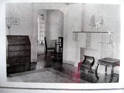
Inside the building there is a framed picture showing drawings of what the rooms looked like in the 30s. This is the living room with its classic Art Deco symmetrical, stepped fireplace.


Posted by Picasa

Monday, January 4, 2010

Step Design is Something New


An interesting feature of step design use during the Art Deco period is that even though the ancient source of the inspiration was so obvious, the art, architecture and fashion garments were celebrated as something refreshingly new.
Here is a silk painting obviously inspired by recent discoveries of ancient buildings found in the jungles of Central America.


A Mayan temple compared with an early Chicago skyscrapper. The architect who designed the building on the right even copied the wide band on the top part of the tower on the left. Both cultures constructed buildings to literally reach up to touch the sky. Both buildings were the tallest, in their day.


Here are some possible sources of inspiration for a silk jacket made by an unknown American designer: the revolutionary Chrysler tower, Aztec temple and an Anastasi basket. All feature step designs that create an uplifting feeling of reaching for the light. Step design could be interpreted as a symbol of optimism and hope. It would be interesting to see if this is so in the work of other cultures that have used the step design element.
Posted by Picasa

Sunday, January 3, 2010

Art Deco Design


Here is an image of my design wall at an early stage of my Art Deco study. I grouped images according to influences on the movement, illustrations of why it was known as a 'total' style, design features, materials and colours.


These are some of the influences on the movement.


One of the predominant design elements that became obvious was the step motif and form. In Europe it seems to have been inspired by ancient Egyptian culture, while in North America the step design elements came from rediscoveries of Meso-American civilisations such as Mayan, Aztec and Incan.


This is work by the British potter, Clarice Cliff, whose work was immensely popular in the late 20s and 30s. Throughout her career she used the step design element as a motif, pattern and a 3D form.
I wrote about the importance the step design in my assessment essay for the History of Design module. It seems to be a reoccuring element in many different cultures. It would be interesting to find out if there is any significance in the timing of these reoccurances. Also, that of the reappearance each time of bright orange in art, architecture and fashion.
Posted by Picasa

Saturday, January 2, 2010

Orange


While I was studying the Art Deco Movement, I put all of the images I collected up on my large design wall. I would group them and regroup them according to how my thoughts were developing. One thing that struck me was no matter how I rearranged the images they always had the same feel.
Then I saw the dominance of the colour orange.


Intense orange. It was bright and cheerful. Hopeful.


It reminded me of the 60s mood. Designers write about a revival of Art Deco at that time but I now think the 60s revival, with the reappearance of bright orange, was a reflection of the optimistic feelings of the time. It was the 'dawning of the age of Aquarius'.
Now I am curious, has bright orange re-emerged every time there was a positive, uplifting, optimistic collective response to the times?
I am on the look out for bright orange.
Posted by Picasa