Home

Wednesday, April 19, 2017

My New Reliable Velocity Iron

This is my old Reliable Velocity iron. It has been reliable but after 5 years I have worn it out. It is not worth repairing, the cost of which would include having to ship it both ways across the country. It is no longer made and has been replaced by an updated model.

This is my new Reliable Velocity iron. I am hoping it has kept the best features of the older model and improved on others.

New on the right. There are a lot more and smaller steam holes. The grooves that shot the steam along the sole plate have gone. It will be hard to compare if the new is more effective but here's hoping.
The top point is pointier - a good feature for detail work but I use this iron mainly for flat yardage. The back is curvier which makes it harder to tell when the straight edge of the fabric is covered with the sole plate.

New on the right. The main difference is the push button digital readout has gone. This was the feature that failed on the older model. My resident engineer says it would have been very difficult to keep the electronics sealed away from the steam chamber. The temperature is now controlled by a manual dial.
The water sprayer has gone. That is OK because I didn't use this feature. The steam-generating chamber produced enough steam to smooth out the driest and most wrinkled fabrics.
The new model has a clearer plastic water chamber so it is easier to see the water level. As a consequence, I don't overfill it as often. 

New on the right. The water filter (bottom left on the older model) has gone. With a steam generator, the water quality can affect its lifespan and efficiency. I am filling the new iron with only distilled water to avoid the buildup of scale and rust in the chamber. Even though the shop I bought the first iron from told me it was OK to leave water in the chamber all of the time, I now empty it at the end of each session. It will make a difference in prolonging the life of the iron.

New on the right. The water fillers illustrate the newer model has a smaller water chamber holding about a third less water. I consider this a negative feature because it means I have to refill it more often. 


I poured water from the old container into the newer iron and this is the leftover water. I don't know if you can see the water line here.

After a short time using the new iron I found another negative feature. I kept naturally putting my hand forward of the rubber handle and unintentionally pushing the buttons with my palms. I found it was easy to bump the circular dial to a different setting. At first, I thought this heavy iron, which I like the weight of, was unbalanced in that my hand went to the centre point and covered the buttons.

 Then I noticed when I kept my hand back away from the buttons my fingers were scrunched against the back of the handle. I have decided the handle design was too short.
I really like that this iron is so heavy. It does a great job without my having to put any weight on the handle. All I need to do is guide it with my hand. 
When ironing I aim to keep the iron down and in contact with the cloth as much as possible and to lift it only when I need to move the fabric. By using the weight of the iron and its feature of being able to continuously produce steam I can get a lot of ironing done relatively quickly for little effort on my part. This is the main reason why I bought this brand again. I am hoping its modifications and my better care of it will ensure we have a long and happy life together.

What is your favourite iron? I would be interested to hear from you.

Monday, April 17, 2017

Working With Itten's 7 Colour Contrasts

"Our sense organs can function only by means of comparisons. The eye accepts a line as long when a shorter line is presented for comparison. The same line is taken as short when the line compared with it is longer. Colour effects are similarly intensified or weakened by contrasts." Itten The Elements of Color, p. 32

Itten's 7 kinds of colour contrast:
1. Contrast of hue
2. Light-dark contrast
3. Cold-warm contrast
4.Complementary contrast
5.Simultaneous contrast
6. Contrast of saturation
7. Contrast of extension

With this Synesthesia series of work, I am working with one hue/colour at a time, defined as a monochromatic colour scheme. It means I am not able to use #1. Contrast of hue. For each individual work to be successful I need to work with other colour properties to achieve contrast.

The Synesthesia series aims to show how I feel about each colour's energy. To express that energy I focus on line, without making a thing, shape or motif and I work with value. #2 Light-dark contrast is my main design tool

# 2. Light-dark contrast. Here I have overlapped with an off-set, dark to light threads over a dark to light ground.

To me, this colour evokes calmness, an immensity in its calmness. To give this feeling I need to show a low level of contrast but still need to have some contrasting elements for the work to be successful, otherwise, there is no energy at work.
I took advantage of one of textiles' strongest features - texture. This low contrast dark to light fabric line up is still interesting to the eye because each fabric has a different texture.
These fabrics also show #6 Contrast of saturation at a low level but the eye can still see a brighter blue beside a dull blue.

When checking for #2 Light-dark contrast I look through a 'Ruby-Beholder' - a red or green plastic strip and or I take a picture with my camera to get a black and white image. 
Here I decided there was just enough contrast of light and dark for the eye/brain to notice while still giving off a calm vibe.

Including too wide a range of light to dark generally is not successful. One needs to limit the range of values to a group or block along the light-dark continuum.
When I am designing a work I take out all of the fabrics I have that would be suitable as far as their other characteristics are concerned. I arrange them in a continuous line from light to dark. I then look along the line to decide which section would best express the feel and energy of that colour. I work with fabrics in that section and put away those either side of the chosen ones.

I am making colour cards to go with each Synesthesia work. The cards have strips of fabric glued to them. When I select the fabrics I aim for the maximum range of values, saturation, and cold-warm contrast because the purpose of the cards is to show the full range of the colour's properties.

A stop for a quick dark-light check during construction. 
Is there enough contrast to effectively express the energy I feel from this colour?

When I make work I do a lot of research and pre-planning in a sketchbook. Next, I sample with the actual fabrics. When I am actually making the work it feels as though I am back at the trial and error stage but this time I am working towards producing that image or feeling I have of what the work should be and it guides my decisions.


Wednesday, April 12, 2017

Backyard Project: All in One - Deer Fence/Gate/Wall

Part of the deer fence is made from punched metal.

The punched metal sheet and cedar boards make an 8-foot high wall from the house and across the east side of the propagation room.

A railing has been installed on the wall. It holds a slider...

...to support a sliding gate to fill the gap in the deer fence.

The holes in the metal allow for ventilation of the propagation room. Air flow will inhibit the growth of moulds on the plants sitting on the propagation table.
It also acts as a veil partly obscuring the view of the garden until the gate is opened.
The famous British garden designer, John Brooks, says 'garden entrance gates are the most important elements of a garden.' They need to be simple and they need to make sound use of materials to provide a firm, dry access to the garden. 
The fence and gate needed to be large in size and built of solid materials to balance the massive rock boulders of the raised garden beds seen on the other side of the garden. The rocks were quarried locally and the fence is made from the same sort of trees that grow in the forest. It is important that a sympathetic barrier is built of local materials.
This gate and fence with the studio building together pull the house and backyard into a single unit forming a protected courtyard separated from the forest. 
The Japanese have made an artform of barriers and they consider the two faces of a fence, inward and outward, and the aesthetic quality of each side is determined by needs and desires. Looking from the outside in towards the sunlit garden one has the feeling of being invited inside. While looking from the inside out towards the low light under the forest canopy the metal fence appears dark and the solid barrier is comforting. 
This gate-fence boundary also provides privacy for the guest patio - more on that in a later post.
While it is an 8-foot barrier to keep deer out of the garden, it is unlikely to stop racoons because they will be able to climb up and over it. I don't think it will keep determined cougar or bear out either.
The next problem we are searching for a solution to is a simple but secure catch and handle for the sliding gate that can be easily accessed from both sides. This is proving to be not as easy to solve as it sounds.


Monday, April 10, 2017

VISDA Current Threads 2017 Exhibition in Ladysmith BC

The annual Vancouver Island Surface Design Association Currents Threads exhibition will open on April 15 and run until April 30, 2017.
This year the group is returning to the Ladysmith Waterfront Gallery, Ladysmith. 
All of the work will have been completed in the last 3 years and has not been shown in any Current Threads exhibition before.
We are anticipating another successful exhibition with many visitors.
The Artist Reception is on April 22, from 2:00 until 4:00 pm. I do hope many of you can attend to enjoy the work and talk to the artists in attendance.
Artists will be sitting the gallery every day from 11 am until 4 pm.
During Ladysmith's Spring Art Tour on April 21st until 23rd, the gallery hours are extended from 10 am until 5 pm.
This annual exhibition is a survey of the most recent work by fibre artists who live on Vancouver Island and many of the smaller offshore islands.
You are all invited to attend.

Thursday, April 6, 2017

New Work: 2 new works on the go

Every day I am in the studio I stitch into this work for an hour or so.

After the tree added its wind drawing I am responding by marking the branchlets I see on the ground after the wind.

I am also working on another for the Synesthesia series.

This series is a response to how I feel about the energy of each colour.
I show the energy through line, value and a fibre art technique.
For this colour, it is cut-back applique and free motion machine embroidery.

A check on the values.
 Is there enough contrast or is there too much contrast? 
Are the darks and lights in the right places to give the feel I want?
I am making 24 in this colour series

Monday, April 3, 2017

Backyard Project: Installation of Electricity and Paper Barrier

The electricians arrived. They asked me lots of hard questions. They couldn't get to work until I had given them logical and sensible answers to all of their questions. Since this project started 3 years ago I have come to realise I am not very good with planning lighting on paper. I need to be in the space and imagine how I will be working in it and moving around. The electricians needed to know what sort of lights and where would the switches go? Take this light at the apex of the roof, will it have a motion sensor to turn it on or will there be a switch somewhere outside the area so I am not walking into the darkness?

How many power outlets do I need above the potting bench? I had to think about what sort of equipment I will be using before I could answer.

The power comes from the power box on the side of the garage along lines strung across the inside of the walls.

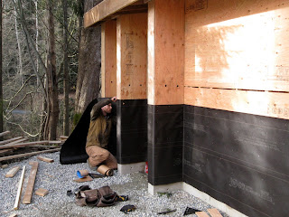
In the meantime, Josh is stapling the black paper barrier to the walls.


The fascia boards have been nailed in place.

Now the electricians have been all of the remaining plywood can be nailed in place.

Plywood is nailed to the walls inside the sheds.

These are the finished walls and ceiling in the shed. We had this finish installed in the studio crawlspace and have been very pleased with how functional it is. There is no maintenance except for a sweeping off of cobwebs once a year. It fits with the industrial look we are going for.


Friday, March 31, 2017

Backyard Project: 2 Sheds With 1 Roof - Naming the Spaces

If you have been following the construction of this building you are likely to have been confused about its configuration. 
Naming the Spaces
Looking at the potting area

Looking at the doorway to one shed and where firewood is to be stacked

Looking north, the building is tucked in behind the garage

Looking at the entrance to the 2nd shed and the space for shelving

Potting area on the left, project bench on the right

All under one roof. View looking south-west.
The north wall of the garage and this roof are part of the deer fence/barrier. I'm not convinced the deer won't try to leap up onto the roof and then jump down into the shed area. People reassure me they won't. Hmm...


Now the plywood is in place it is easier to see the spaces.
Shed doorway with firewood storage on the right.

Back shed with a storage area where the orange ladder is leaning.
Is it clear now how the different spaces fit together?


Wednesday, March 29, 2017

Backyard Project: 2 Sheds Starting to Take Shape

The framework for the 2 sheds is coming along.

Another delivery

Sheets of plywood (left), roof beams (bottom right), fascia boards (top right).
I had to ask to be able to tell you that.

The first lot of plywood is nailed in place to make the west wall.

Josh hoists up the first roof beam and puts it in place - on a very wet and cold day.

Now all of the roof beams are in place. 
The building is really taking shape now.